Krisp Studio
Krisp Studio

About the Motion Graphic
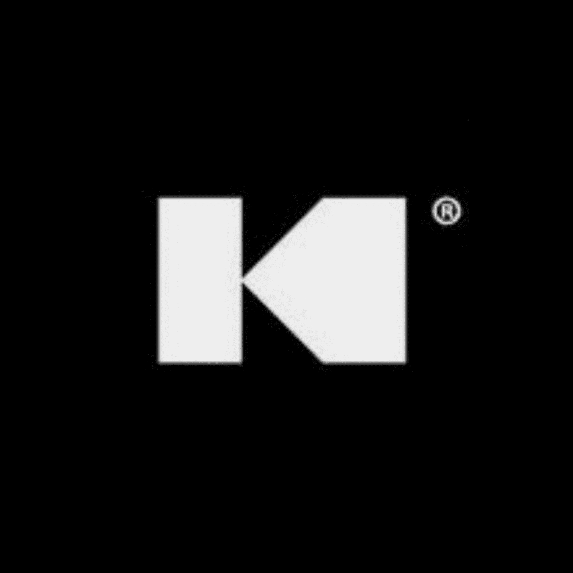
Krisp Studio is a creative production house built on one principle, clarity through craft. Their work spans UI/UX Design making their clients websites online real-estate. When they came to us, their logo existed as a static mark. Strong in form, but silent. They needed it to move, to carry the same weight and intentionality on screen as it did in print.
The brief was precise: modern, minimalistic, and unmistakably Krisp.
Project Approach
We built the animation around the concept of controlled energy, the idea that restraint, when applied with intention, communicates more than complexity ever could. The "K" mark became our starting point. Rather than adding to it, we stripped everything away and asked: what is the essential movement of this brand?
Every motion decision was made in service of that question. Timing was tight. Easing was deliberate. Nothing entered the frame without purpose, and nothing lingered longer than it needed to.
In Blender, we worked with clean geometry, neutral material shading, and precise camera movement to let the form breathe. The result doesn't announce itself, it arrives, ending with the K mark.
What was Created
• A 3D animated logo sting optimised for YouTube intros and social media bumpers
Clean geometric motion built around the existing "K" mark with zero distortion of the original form
A neutral, studio-grade material treatment — matte surfaces, controlled light, minimal shadow play
Multiple export formats: square (1:1) for Instagram, horizontal (16:9) for YouTube, and vertical (9:16) for Reels and Shorts
A motion language that can be extended across future Krisp Studio content
Result
The animation gave Krisp Studio a presence that matched the quality of their output. What was once a static identity now opens every piece of content with the same confidence the brand projects in its work. Clean entry. Strong hold. Clean exit. Exactly Krisp.

More Projects